Designing a B2B website service page is no easy feat. That’s why we’ve provided some of the best examples of service and product pages online to help ignite some inspiration for your website redesign journey. These six examples make up the ideal B2B service page that is effective at providing potential prospects with the information they need about the solutions you provide that can ease their pains and challenges:
For a B2B company, a service or a product page is one of the most important pages on your website. Therefore, when it comes to redesigning it, you may find that it’s also one of the most challenging pages to get right. What does a service page need to have? What elements are required to make this page as effective as possible? In essence, your service page needs to:
- Looks great to attract visitors
- Tell a story of what you offer
- How your services/products provide the solution that the prospect is looking for
- How your company stands apart from the competition
Following this, we’ve shared six elements your service page needs to have and the B2B companies that are doing it right:
1. Focus on the benefits, not the features
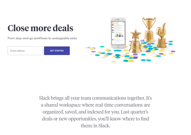
While you no doubt want to convey the quality of your services and/or products, you shouldn’t focus too much on the features. Rather, explain the benefits a prospect will receive from buying from your company instead. 89% of B2B buyers spend a vast amount of time researching conducting an average of 12 searches prior to engaging on a specific site. Now due to the pandemic, 33% of buyers spent more time researching products before making a purchase. Therefore make sure to take a leaf out of Slack’s book. From the outset on one of their solutions, they tell you about the benefits you could get that could help you solve a particular challenge - neatly balancing between features and the benefits.
2. Define your USPs
B2B companies work in highly competitive markets. Prospects will be spending much of their time looking around multiple company websites.
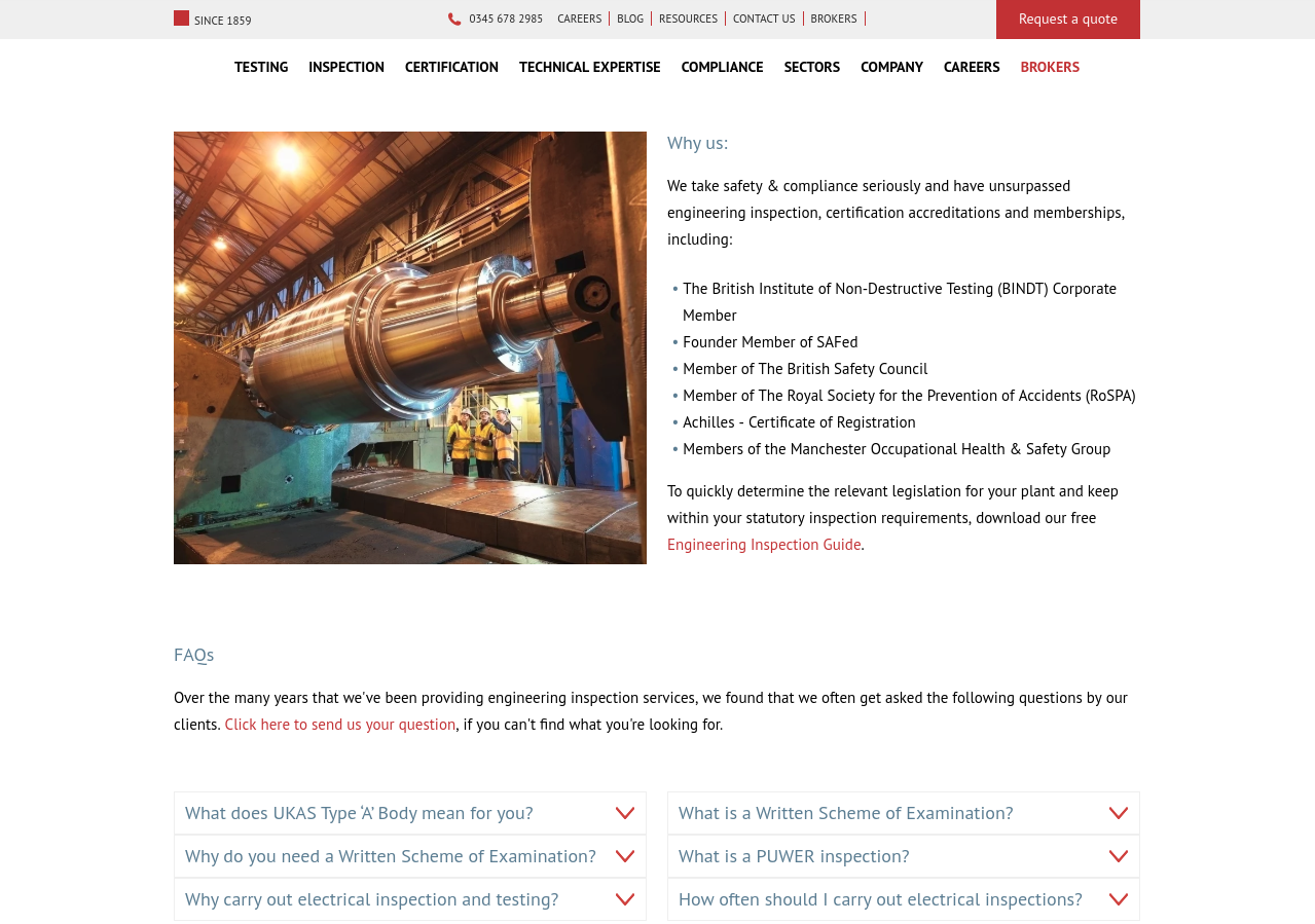
With an abundance of similar services and/or products available to prospects, it’s vital that you make sure your company stands apart from competitors. Your service page should clearly define your USPs. What makes you stand out from others in your industry and why does it matter or benefit buyers? British Engineering Services get straight to the point on their engineering inspection pillar page with a section that tells a prospect “why us”, listing some pretty impressive accreditations.
3. Easy, functional, standout design
User experience is a critical aspect of your B2B service page, so you have to be careful not to overdo it on the design.
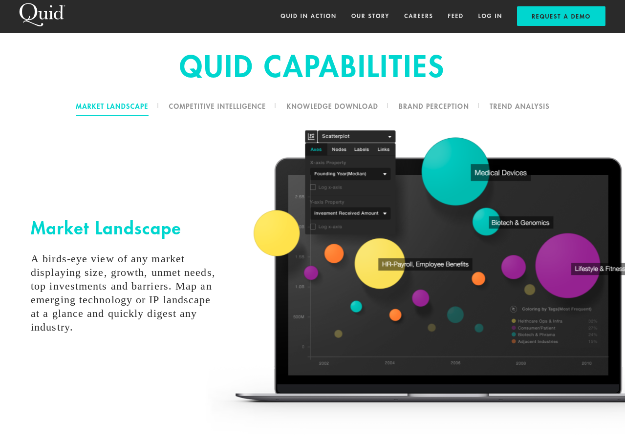
Having what seems like a breathtaking design may look good at the outset, but if the journey is too complicated it could confuse your visitors and they may leave the site (and go to a competitor instead). Therefore, you need to learn to create a balance between beautiful design and functionality. Ideally, less is more in the case of Quid, who opts for a minimal design. This approach offers a greater experience for a visitor where they can easily navigate the solutions they provide and even get a taste of how the solution works and its capabilities.
4. Write quality content
One of the most important things you need to do on your service page is to write quality content that is targeted at the prospects you want to sell to.
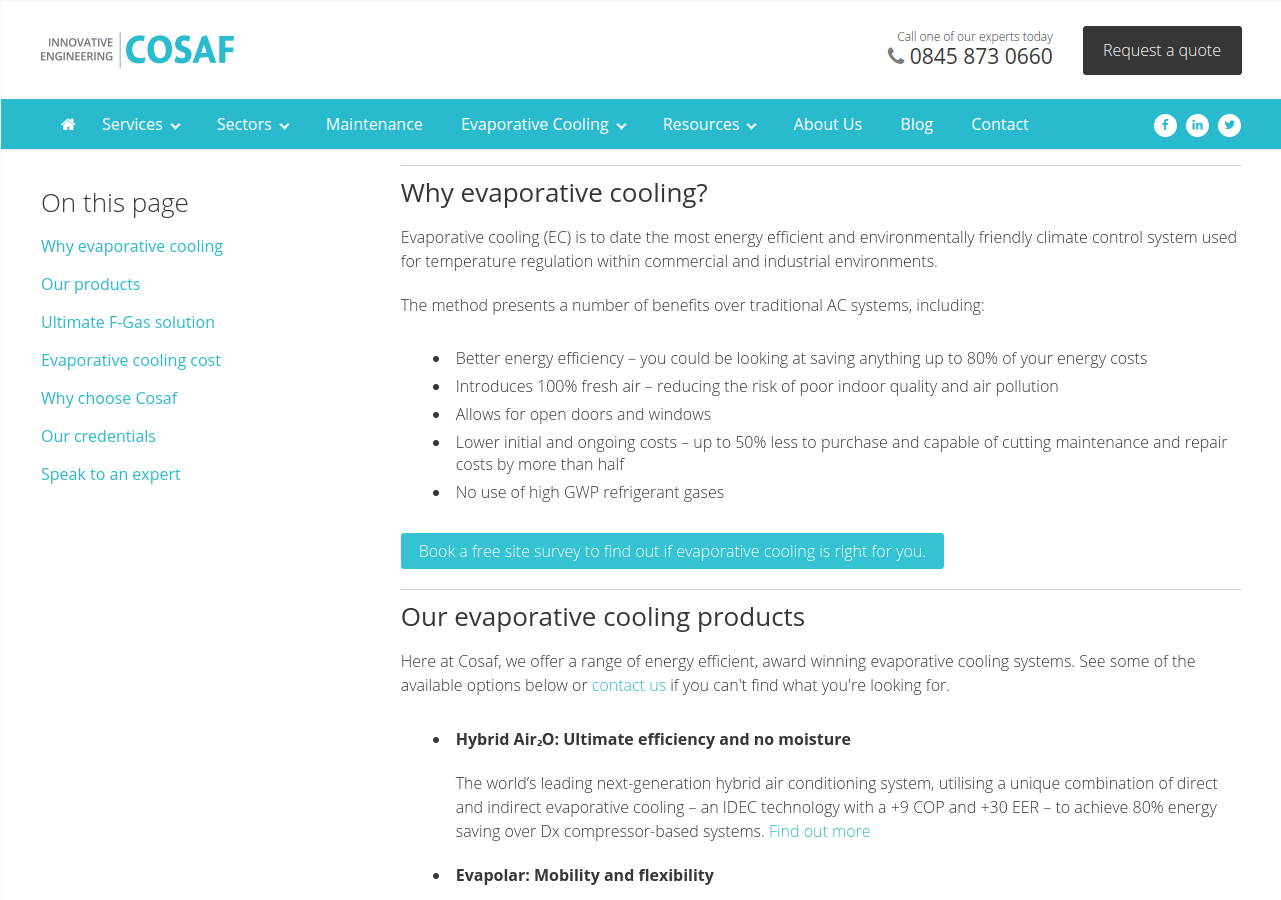
You must approach the page with the buyer in mind. According to DemandGen Report more than half of B2B buyers rely on content that educates as part of their research process and 67% of these buyers also wanted content that included more input from industry thought leaders. Your service page should therefore include high quality, educational content that is buyer-centric. A good way to achieve is to create a pillar page around a central topic in which other relevant topics can stem from. These topics should be based on what a prospect may search on the internet at any stage of the buyer’s journey, looking for the answers to their pains. As an example, Cosaf does this through its evaporative cooling page.
Their pillar page includes well written content that covers all stages of the buyer’s journey, from the awareness stage right down to the decision stage.
5. Testimonials and case studies
If you’re selling a service or product, showing proof of success can be key to attracting potential prospects to buy. Using testimonials and case studies can help your B2B business establish credibility without coming across as an aggressive sales pitch.
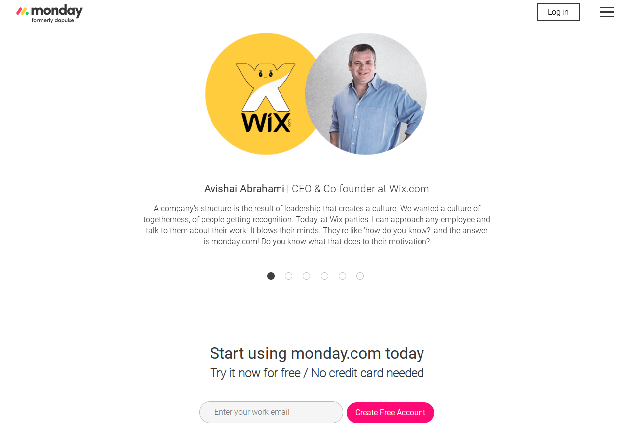
Building credibility and trust was one of the top goals for content marketing in the last 12 months, according to a study by Content Marketing Institute. After all, prospects want to see how your service/product will be able to solve their pain or challenge and using success stories will build trust. Take it from Monday.com who sell team management software. They use their testimonials from their clients as powerful advocates for their company - and they really sell the benefits they’ve gotten from using the team management software.
6. Great UX
UX (short for user experience), is an integral part of your thinking for designing a great service page for your B2B company.
We’ve mentioned previously how your content needs to be buyer-centric, well now you need to ensure that the experience on your website is visitor-centric. People can be finicky and it won’t take long for them to go elsewhere (say, to your competitors) if the UX on your website isn’t up to scratch. According to Nielsen Norman Group, the majority of visitors spend less than 59 seconds on a website, so first impressions are important.
Anything from poor page loading speeds to confusing navigation - these can frustrate buyers quickly enough to make them leave. However, you can prevent this from happening by ensuring your website is built to help your visitors find the information they’re looking for in a swift, smooth manner.
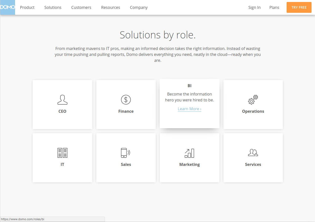
Domo do UX very well on their solutions page by splitting up their offerings three different ways. Solutions can be searched for by role, by industry and by data source. This is a fantastic way to really hone in and capture prospects from all angles and helps guide prospects to the right solution that suits them.
Conclusion
Before you begin redesigning your service page, take a step back and look at your current one. Does it meet the requirements of a B2B prospect? If it doesn’t, then you need to incorporate the six elements we discussed to ensure your service page is as effective as possible:
-
Focus more on the benefits of what you’re selling and less about the features - you want to be seen as buyer-centric, not product-centric
-
Define your USPs - what makes your B2B company unique from the rest that only you can offer to prospects to help solve their pains?
-
Create a design that is not only great to look at, but more importantly, is easy and functional
-
Writing quality content helps educate your buyers and will help you be seen as industry thought leaders
-
Testimonials and case studies will help build trust and integrity with your prospects and customers
-
Ensuring a good UX on your service page can mean the difference between converting a lead or losing them to your competitors.


.png?width=115&height=183&name=sade%201%20(1).png)