Often, during a B2B website redesign, the blog design tends to fall by the wayside, but it’s actually one of the most important aspects of your website that people will visit to find information that will answer their query. That’s why we’ve put together a list of the best B2B blog design examples to give you some inspiration for when you decide to give your website a refresh.
Table of contents:
Blogs, along with video marketing and infographics are among the three primary forms of media used in content strategies today, according to HubSpot's Marketing Statistics. Clearly, keeping on top of your B2B blog is a top priority if you want to be attracting new visitors and nurturing them into leads. However, it’s not just about churning out content and hoping for the best. Your blog design needs to be able to catch a prospect’s eye if you want them to stick around long enough to engage with your content.
1. HubSpot
HubSpot’s blog design is always evolving based on how people engage with content. For instance, HubSpot includes the average time it will take you to read the blog post - helping users determine whether they have the time to invest in the content. Additionally, features such as the author’s Twitter handle and fixed social sharing create a sense of encouragement around engagement. One aspect we really like about this example is how the blog begins, by answering the query about the top-rated handsets by providing eleven examples of the products and their reviews. Answering the question of the blog at the beginning is a handy way to try to gain a Google Snippet. For readers who are time-poor, they now have the information they were looking for and can be on their way. For other readers looking for more information, the blog offers informative content so they can scroll down to read more about each handset type.

2. Think with Google
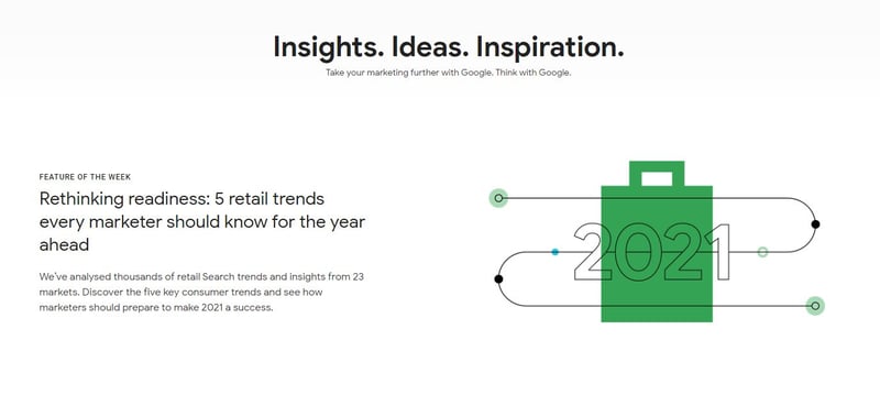
What can we say? Think with Google’s blog is clean, readable and utilises lots of white space. What we love about this blog design is that it’s fuss-free and fits with Google’s branding and only gives you the information you need. They also incorporate moving image as a feature in some of their blog posts witch is in keeping with the growing trend of video marketing.
3. Canva
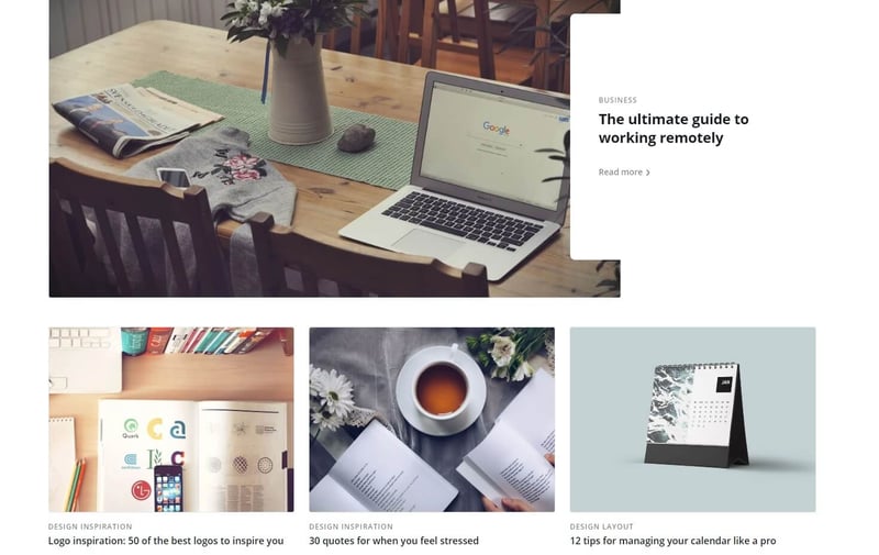
Canva is a handy free tool to use if you want to create anything from logos to social media images and presentations using a range of templates, stock imagery and more. When it comes to their blog, Canva certainly keeps their colourful, whimsical branding on point and they are not afraid to leave plenty of white space to keep their blog visually appealing to the user.
4. Vistair
In this example, we take a look at Vistair’s B2B blog overview page. What’s really good about their design is the interesting way that they’ve displayed their topic filter - with an icon of a plane that you can use to navigate to the different topics. Additionally, the blogs themselves are neatly displayed with eye-catching featured images to draw you into clicking through to the posts.
5. Moz
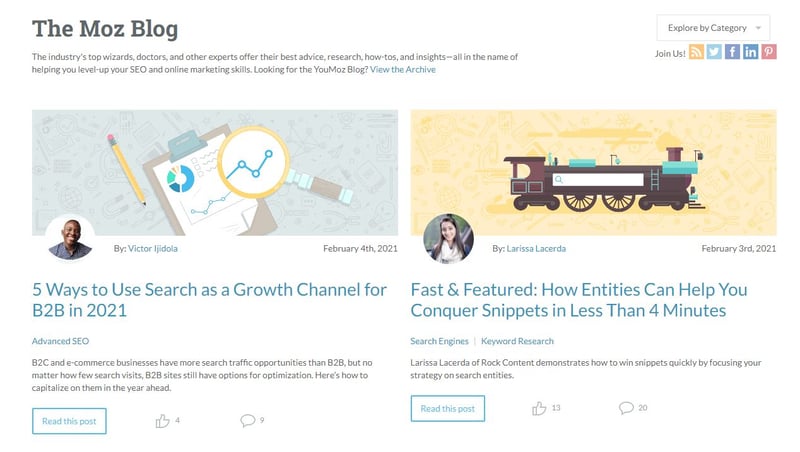
What we love about Moz’s blog overview page is the great use of white space and the ability to filter the blogs according to numerous categories. One other element is adding in the “like” and “comment” buttons so that you get an idea of the popularity of the topics being discussed in the blogs, but which also prompt you to want to contribute to the engagement.
6. Ahrefs
Ahrefs provide a data-driven marketing tool that offers a huge index of backlinks, keywords and content to the B2B and digital marketing community. Their blog posts not only contain heaps of informative content, examples and pictures but the posts also include features like interactive table of content that moves along when the user scrolls up and down the page.

7. Econsultancy
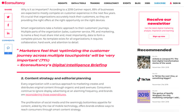
Econsultancy’s blog uses striking design in keeping with their branding and cleverly uses the colour red in this example to highlight important elements within the blog. For instance, the social sharing buttons, the newsletter subscription, hyperlinks and pull-out quotes all stand out.


.png?width=115&height=183&name=sade%201%20(1).png)