Nietzsche’s theory of Eternal Recurrence states that all universal existence has been recurring, and will continue to recur, infinitely across time or space. Just like fashion trends coming back around, such as bell bottoms and mullets, website design trends are no different.
The team at Axon Garside have put our thinking caps on and have put together a list of predictions of what we think will be the top B2B website design trends for 2023 in the UK - check them out below.
1. PLAYFUL, OPTIMISTIC UX DESIGN
As ever, a growing number of B2B brands are moving away from the corporate image, and making themselves more light-hearted and relatable.
In fact, a recent study revealed that 58% B2B marketers believe humanising their brands will lead to more revenue. So it comes as no surprise to see more brands appearing more playful.With vibrant colours, bold text, and witty copy, such playful website design reflects the general public’s desire for a brighter future as opposed to the darker times of the past year or so.
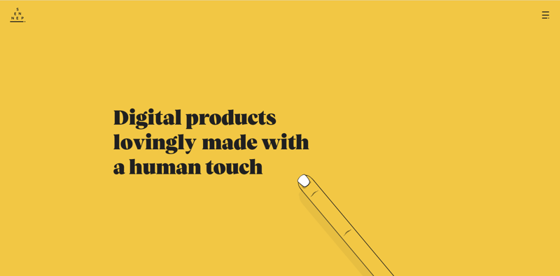
Below are two examples of B2B website design that are bold and positive in attitude and style. With both Sennep being a creative design agency, it’s important for them to provide their visitors with a positive UX that expresses this creativity. Hootsuite, on the other hand, uses colour and concise copy in an equally positive manner. It’s no doubt that B2B websites will continue to move towards upbeat, high-spirited web design as we move into the new year - the future is bright!

2. ONE-PAGE WEBSITES
The very best websites can present all the key information about your product or service on a single webpage without overwhelming your visitor. Content design and good web page structure both play vital roles here.
A well-designed one-page website can get your message across as they learn about what you have to sell just by scrolling down your page. It provides a similar feel to scrolling down a social media feed.
One page websites are well suited to mobile devices. That said, the effectiveness of this sort of website design will depend on whether it’s suited to your business and brand. It’s advisable to take a content-first approach with web design - a one-page website might not adequately show off everything you have to offer if you need to relay a lot of information.
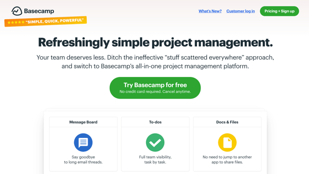
Plus, with this type of design, distractions are largely eliminated and a straightforward narrative is created. As an example, Basecamp’s website homepage (shown below) tells the story of their service concisely; with fewer navigational options and fewer images than a typical webpage.
3. GOODBYE HERO, HELLO TYPOGRAPHY
A hero image is usually one of the first things to consider when designing your B2B website. An image says a thousand words about your business and offering - so why are so many B2B websites completely ditching the hero image and opting for huge text instead?
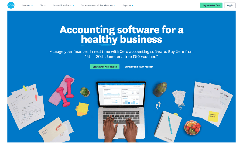
By relying instead on oversized typography to make a first impression on the visitor, the brand identity is tastefully expressed and a statement is immediately made. The visitor is eager to discover more about the mysterious business, being teased into exploring the rest of the website. Colourful typography with a focus on style is increasing in popularity, and this gorgeous homepage of Xero features appealing copy over a minimal, yet relevant hero image - increasing the whitespace on the page.
4. INCLUSIVITY AND ACCESSIBILITY
Here at Axon Garside, we predict a continuation of the shift towards even more consideration of all website users, in both ease of use for different abilities and in the representation of identities. Of course, inclusivity and accessibility within website design are more than just a trend - it’s a necessity.
Good accessible website design caters towards people of all abilities, backgrounds, ages, and knowledge levels. This can be done through the use of colour, text contrast against backgrounds, and inputting alternative text for images on your site. We have a whole blog on making your website accessible if you’d like to learn more!
When it comes to inclusivity within web design, business branding, messaging, and the use of stock images are just some examples of how you can implement changes towards a more equal future - starting with your B2B website. What’s more, an innovative idea would be to provide a wide range of pronoun options within your landing page forms so that all possible visitors to your website feel welcomed, and as though their gender identity has not stopped them from being considered as a persona.
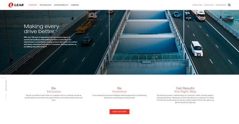
Lear has honed in on the diversity of their team via the hero copy on their homepage - as seen below.
5. Give Your Stats A Makeover
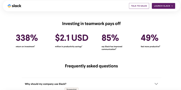
Statistics play a huge role in validating reasons to buy your product or service. And recently, data visualisation is becoming an increasingly popular method in giving your stats a fresh makeover.
Data visualisation is a common trend amongst SaaS providers to illustrate ROIs and major milestones. By presenting your statistics in this way, they will stand out much more and easier to digest.
Slack is one SaaS providers that takes full advantage of data visualisation as shown in the example below.
6. PRIORITISING LOAD TIME AND PAGE SPEED
Website visitors have high expectations for load time and page speed, with 77% of users preferring to purchase from a faster website - it’s your mission to ensure your website loads fast if you want to reduce bounce rate and convert as much as possible.
As the previous years has show, we don’t think the need for ultra-fast load time is going to be going away any time soon. If you want a successful B2B website in terms of SEO and UX, you should speed up your pages through methods such as image optimisation and minimising the number of fonts you use.
7. SMART CONTENT
And finally, we just had to include the use of smart content in our 2023 website design predictions. Using smart content on your website provides users with the ultimate personalised experience, and is sometimes also referred to as dynamic or adaptive content.
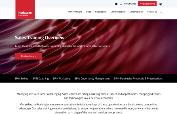
Smart content is content that changes depending on the behaviour of visitors, such as language, location, or other demographics. Content that is specific to the individual is guaranteed to create a great UX that makes the visitor feel valued and considered by your company. HubSpot’s website page builder modules support smart content and it seems to be gaining popularity, continuing to do so into the new year! The below example of Huthwaite shows just one version of a CTA, which will change depending on the information available about the visitor. If the visitor has visited the site before, the copy may be altered to suit this.
From our predictions, we can see that 2023 is all about creativity, ease of use and trying to humanise your brand. And, considering some web design features that may seem out of the box to some. The process of website development and design is forever evolving, and we created a guide on this journey from start to finish.


.png?width=115&height=183&name=sade%201%20(1).png)